| batman begins manip -
Posted on 12-04-2006 18:16 |

|
Phil
Vigilante

Awards:

| 
Posts: 2061
Location: Gotham City
Joined: 30.07.05
 |
|

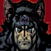
i just changed some stuff around to make it more like the michael keaton cowl. and i put ::comicbatsymbol:: cuz it looks cool. besides, it's used to make the enemies shoot at his chest and not his head.
http://batmanytb.com/pictures/thumbnails.php?album=4 |
  |
| RE: batman begins manip -
Posted on 12-04-2006 22:54 |
|
Chris
Dark Knight

Awards:

| 
Posts: 2999
Location: Richmond, Indiana
Joined: 22.06.05
|
|
That looks sweet! Great job!

|
   |
| RE: batman begins manip -
Posted on 12-04-2006 23:38 |

|
Panzer
Blue Collared Worker

Awards:
None
| 
Posts: 369
Location: Garland, TX
Joined: 14.01.06
|
|
Very Cool!
John Hinton

Panzer's MySpace |
|
|
| RE: batman begins manip -
Posted on 14-04-2006 21:40 |
|
|
Phil
Vigilante
Awards:
|
Posts: 2061
Location: Gotham City
Joined: 30.07.05
|
|
and here i was thinking i wud get alot of replies..lol
http://batmanytb.com/pictures/thumbnails.php?album=4 |
|
|
| RE: batman begins manip -
Posted on 14-04-2006 22:47 |

|
Caleson
Dark Knight
Awards:
None
|
Posts: 1631
Location: Rockville, IA
Joined: 24.06.05
|
|
That's pretty cool, Phil. I think making the chest emblem look more like it's shaped into his chest would've made it even better, though that may be tough to do. Maybe could've been just a smidge smaller too.
Making the Utility Belt the same shade of yellow as the chest emblem could be nice also. The cowl, on the other hand, looks great. Nice job once again.
I'm a little surprised there aren't more replies too... Oh well. Just give 'er time. ::yellowwink::

Edited by Caleson on 14-04-2006 22:49 |
|
|
| RE: batman begins manip -
Posted on 15-04-2006 00:48 |
|
|
Panzer
Blue Collared Worker
Awards:
None
|
Posts: 369
Location: Garland, TX
Joined: 14.01.06
|
|
lol , ya bro I know how you feel.
John Hinton
Panzer's MySpace |
|
|
| RE: batman begins manip -
Posted on 26-04-2006 23:03 |

|
XforeverXknightX
Blue Collared Worker
Awards:
None
|
Posts: 440
Location: Gotham City
Joined: 07.08.05
|
|
|
Caleson wrote:
That's pretty cool, Phil. I think making the chest emblem look more like it's shaped into his chest would've made it even better, though that may be tough to do. Maybe could've been just a smidge smaller too.
Making the Utility Belt the same shade of yellow as the chest emblem could be nice also. The cowl, on the other hand, looks great. Nice job once again.
I'm a little surprised there aren't more replies too... Oh well. Just give 'er time. ::yellowwink::
I agree one hundred percent with you caleson, otherwise kudos to you phil, it looks good
"I went around the world, searched in all the shadows. And there is something out there in the darkness, something terrifying, something that will not stop until it gets revenge... Me"
Check out my fan fics!!!
http://batmanytb.com/forum/viewthread.php?forum_id=35&thread_id=219
http://batmanytb.com/forum/viewthread.php?forum_id=35&thread_id=220
http://www.batmanytb.com/forum/viewthread.php?forum_id=35&thread_id=864 |
|
|


 Home
Home